Fonts
Completion requirements
Preliminary task | Research & Planning | Coursework development | Creative Critical Reflection
The rationale for the choice of fonts is still not clear. Some justification for choosing the font would be appropriate.


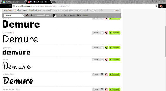
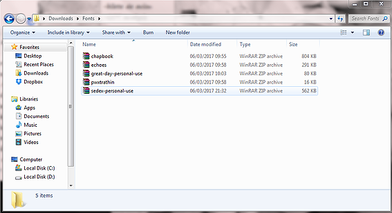
Tea and I started looking for fonts for the text on different sites. We were thinking of using something simple and maybe lowercase for the names as well, so that we don't attract attention to the text but keep the audience focused on the actions of the character. The title will appear at the end of the openening, similar or the same as the rest of the text.
Why? This mostly happens in trailers. The nine frame exercise based on artofthetitle.com illustrates that the title usually appears mid sequence.
Last modified: Monday, 10 December 2018, 9:52 PM