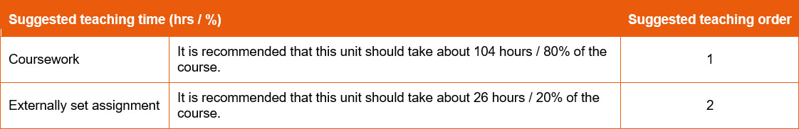
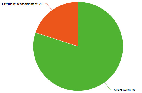
Ideally a short, overview, visual item. The 'map' worked well, but that did focus on delivery models. Might a diagram be better, making use of the existing SOW data?
Map vs Pie chart vs other graphic? Even user choice?