Component 2 Example Candidate Response - Low (final outcome)
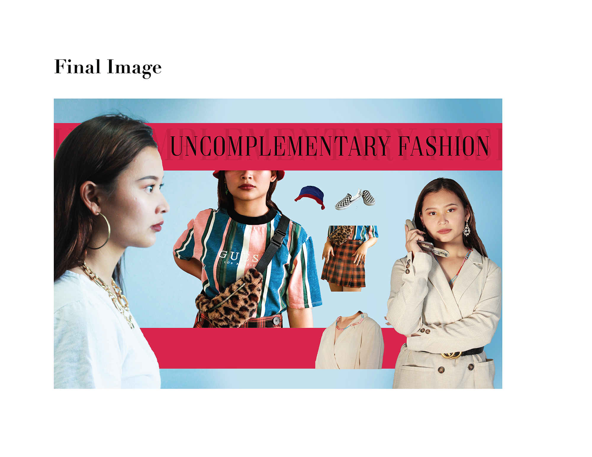
The candidate has composed a single layout for the online magazine feature. A single layout may not provide sufficient opportunity to realise a well-researched and well-developed style guide. A single layout would require a candidate to manage a variety of visual elements to effectively communicate content and meaning.
The candidate has produced a simple and straightforward layout which relies on the qualities of elements such as colour, typography and imagery. The candidate has used large and small images, colour bars, background colour and text with shadow.
They have sought to illustrate the idea of uncomplimentary fashion. There are some appropriate choices of images from previous photoshoots. There is a clear attempt to create a visual dynamic by combining portrait and profile images. Colour bars are used not only to structure the composition but to provide a margin for some images.
